Report Types
The software offers three types of built-in reports, each detailed below. Additionally, an essential aspect of reports is the Report Source, which is also explained in this page.
Report Sources
A Report Source provides the underlying data for the given report. Each Report Source focuses on a specific entity, such as trucks or loaders, and includes relevant fields for analysis. Choosing the right Report Source ensures the report reflects the intended aspect of the simulation or operation.
The following table outlines the currently supported Report Sources.
| Report Source | Description |
|---|---|
| Grid | Fields related to grid power and energy usage. Relevant only when grids are specified within the model. |
| Source | Fields related to the source of mined material. Value Fields are available to report as values. |
| Destination | Fields related to material destinations. Value Fields are available to report as values. |
| Loader | Fields related to loaders. |
| Truck | Fields related to trucks. |
| Energy | Fields related to energy usage. Relevant only when battery-electric trucks or electric shovels are used. |
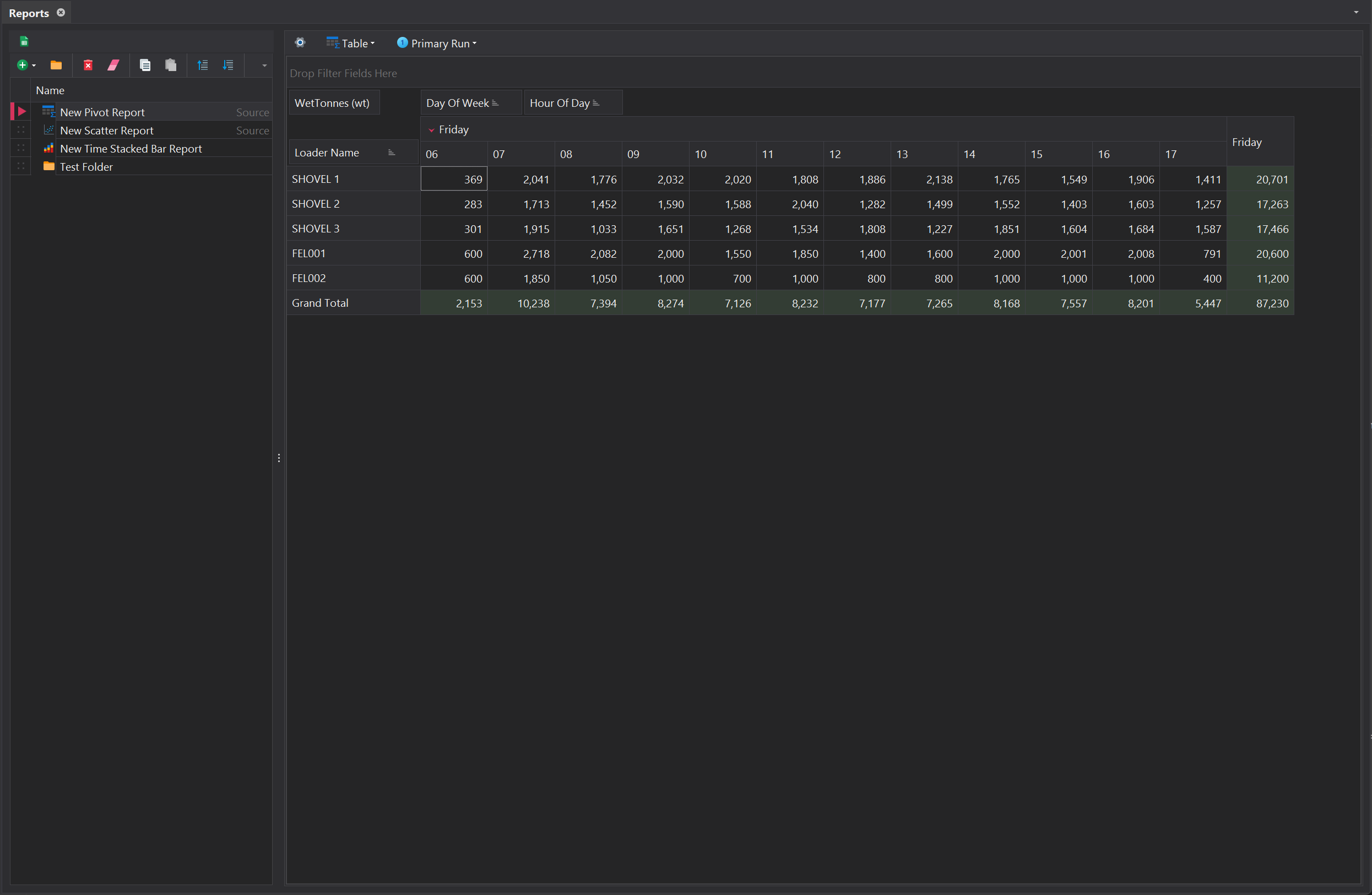
Pivot
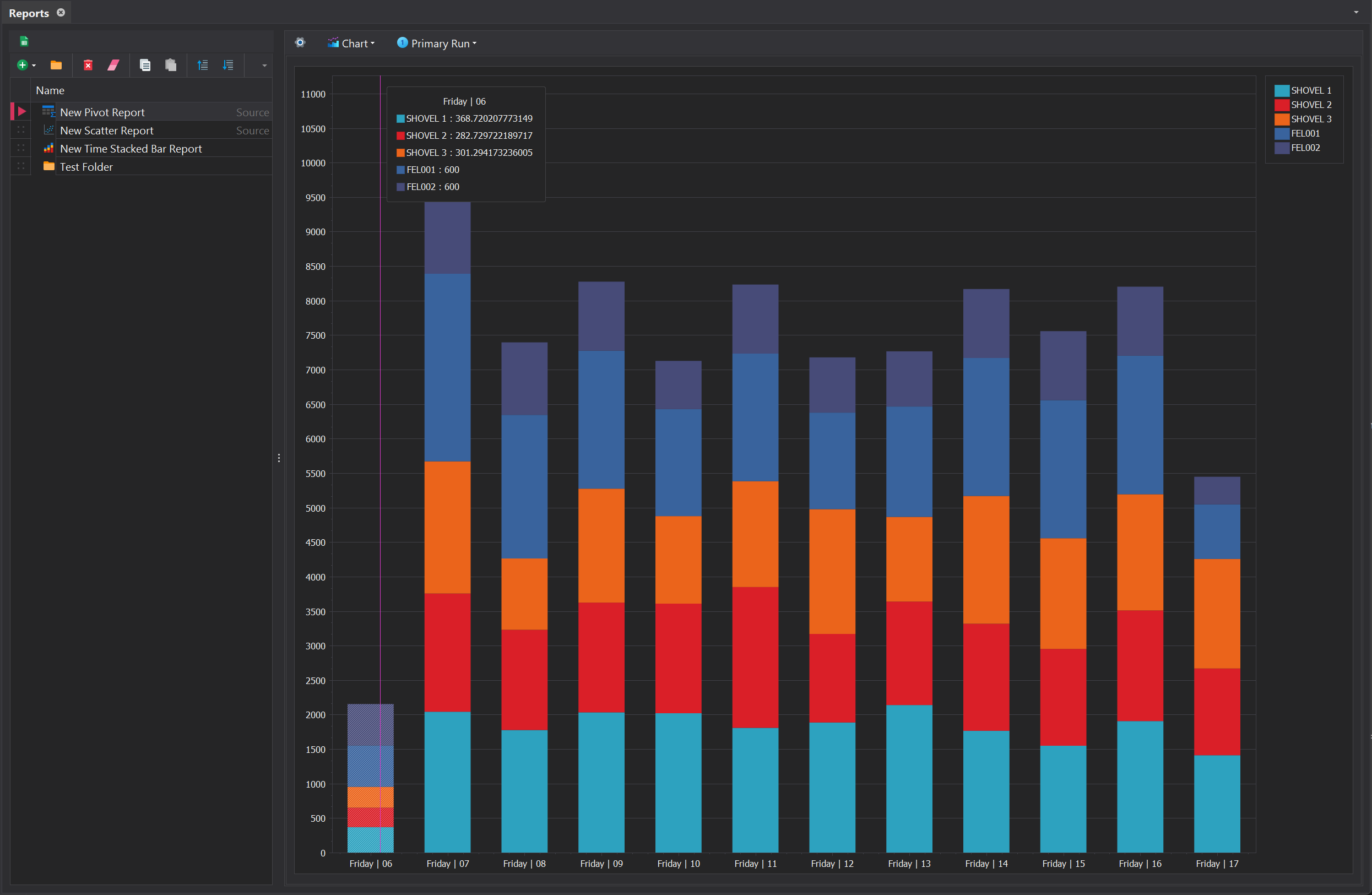
Pivot reports are useful for generating summaries and analysing data efficiently. They allow you to group, filter, and aggregate, providing quick insights into trends and patterns. Additionaly, the opion exists to graph the pivot data to represent it visually.
Settings
| Setting | Description |
|---|---|
| Report Source | Specifies the Report Source to be used for generating the report. |
| --- Table --- | |
| Show Values in Rows | Displays aggregated values in rows rather than the default column format, making it easier to compare multiple metrics side by side or align values with corresponding row labels for better clarity. |
| --- Chart --- | |
| Series For Columns | Determines whether the chart's series are created based on columns or rows from the associated Pivot Grid. |
| Show Point Labels | Toggles the visibility of labels on individual data points within the chart, providing precise value information for each point. |
| Chart Type | Specifies the style of the chart (e.g., bar, line, pie) to best visualise and present the data. |
To display the pivot data as the selected chart type, choose the 'Chart' option from the dropdown menu next to the ⚙️ button.
Fields
| Fields | Description |
|---|---|
| Filters | Specifies the fields used to filter the data in the pivot table. Filters allow you to focus on specific subsets of the data. |
| Columns | Defines the fields that are displayed as columns in the pivot table. These determine how data is grouped and summarised horisontally. |
| Rows | Defines the fields that are displayed as rows in the pivot table. These determine how data is grouped and summarised vertically. |
| Values | Specifies the data to be aggregated or calculated in the pivot table. Typically includes numerical fields that are summed or averaged. |
Scenarios
The Scenarios panel enables the comparison of multiple simulation scenarios side-by-side within the same report. By default, this functionality is disabled. To enable it, the 'Scenario' reporting field must be added to either the Rows or Columns, allowing Scenario instances to be selected for comparison.
Scatter
A Scatter report is primarily used to visualise the relationship between multiple stochastic runs within a scenario. It helps identify trends, correlations, or outliers in the data, making it easier to analyse patterns and assess the strength and direction of relationships between variables.
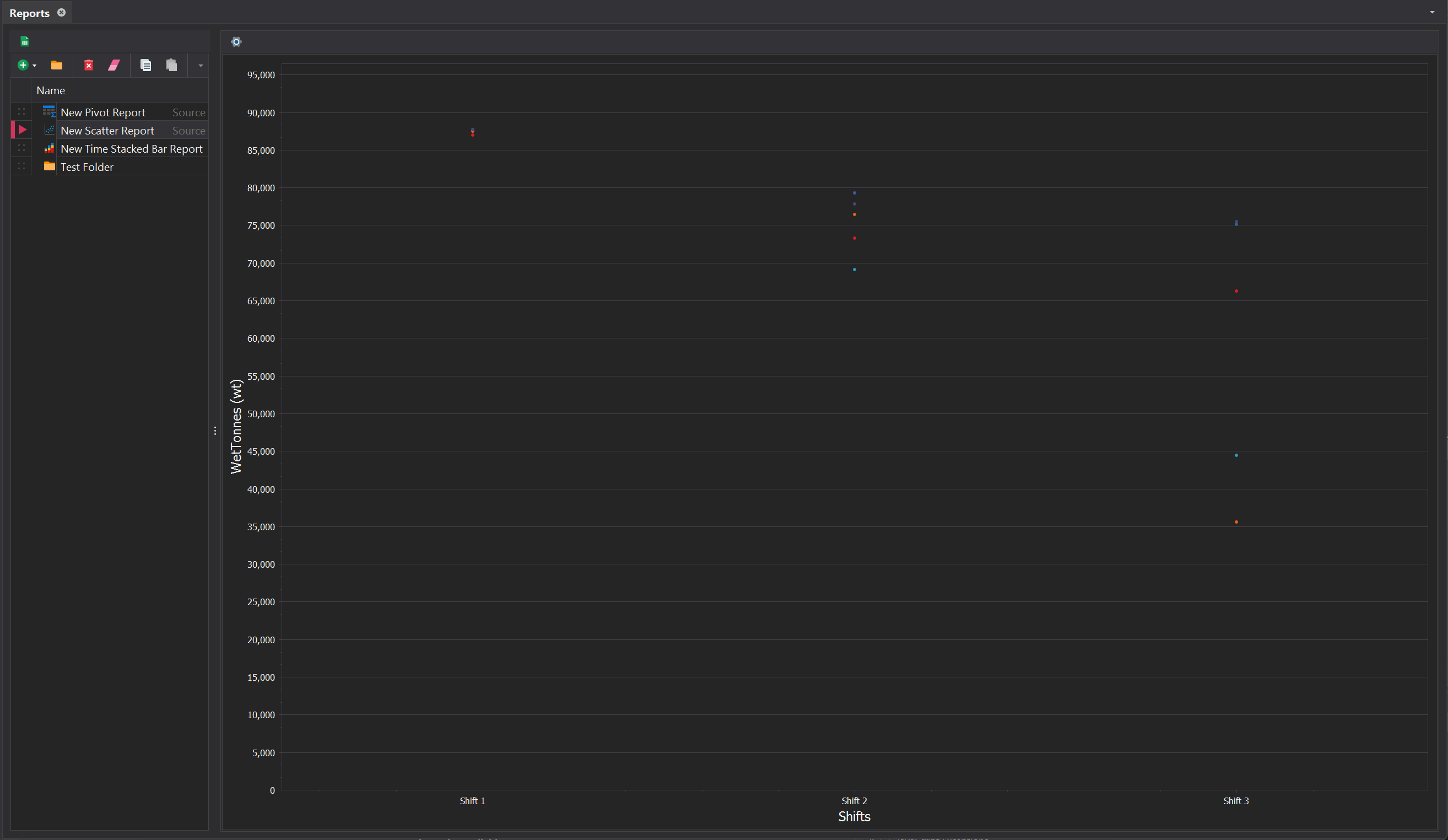
Settings
| Setting | Description |
|---|---|
| Report Source | Defines the data source used to generate the report, determining the fields and metrics available for analysis. |
| Period Set | Specifies the time interval for the report, such as shify, daily, weekly, or monthly periods. |
| Value Field | Indicates the primary metric or value being reported, such as production totals or energy consumption. |
| --- Display --- | |
| Show Average Line | Displays the average line on the scatter plot, providing a visual reference for the mean value of the data points |
| Average Line Thickness | Adjusts the thickness of the average line, allowing for better visibility or a more subtle appearance. |
| Average Line Color | Customises the color of the average line to help distinguish it from other elements in the plot. |
| Point Size | Controls the size of the points on the scatter plot, allowing for adjustments based on the data density or visual preferences. |
Filters
Filters in a Scatter report refine the data displayed by applying specific criteria. They can target specific equipment, material types, or locations, focusing the report on the most relevant data for analysis. By excluding irrelevant data, filters ensure the report remains clear, concise, and actionable.
Filters are managed using the toolbar at the top of the Filters control. Each filter entry requires selecting a field from a dropdown menu and specifying its value by typing directly into the filter cell. The Filter Preview provides a reference list of available values, ensuring precise and efficient filtering.
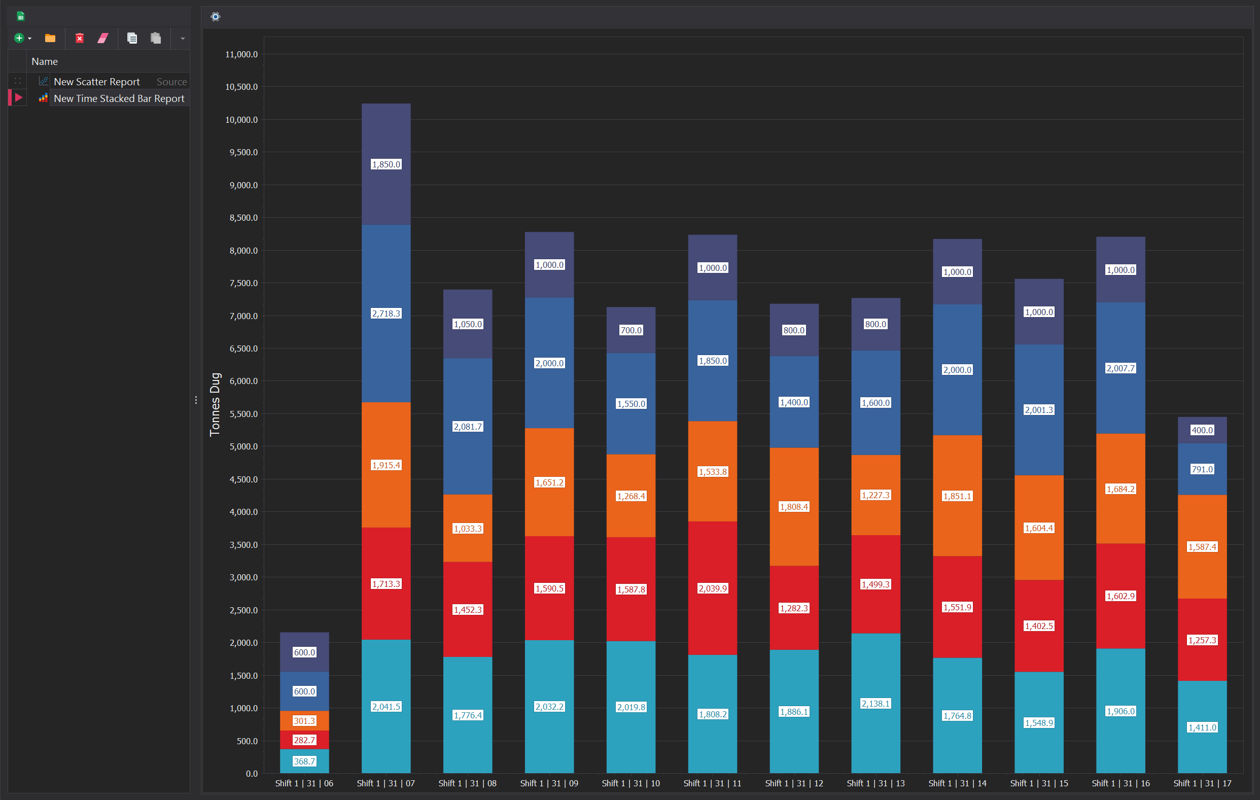
Time Stacked Bar
A Time Stacked Bar report is a type of chart that displays data over a sequence of time intervals, breaking each interval into stacked segments representing different categories or components. It provides a clear visualisation of how total values change over time and how the contributions of individual components compare within each time segment.
Settings
| Setting | Description |
|---|---|
| Report Source | Defines the data source used to generate the report, determining the fields and metrics available for analysis. |
| Period Set | Specifies the time interval for the report, such as daily, weekly, or monthly periods. |
| Granularity | Allows further subdivision of the Period Set, enabling data to be split by finer intervals, such as hours or days. |
| Value Field | Indicates the primary metric or value being reported, such as production totals or energy consumption. |
| Breakdown (Color) Field | Determines how the Value Field is categorised, using colour to represent different categories. |
| --- Display --- | |
| Label | Toggles the visibility of labels for each individual stacked category. Labels can display either the percentage contribution or the absolute value of each category. |
| Is full Height | Values in each category (e.g., time intervals or groups) are normalised to total 100%, regardless of their absolute magnitudes. The height of each bar or column will always be the same, but the proportions of the segments within represent their relative contribution. |
| Show Legend | Toggles the visibility of the legend, which provides a key to interpret the breakdown field and its corresponding categories. |
Filters
Filters in a time-stacked bar report refine the data displayed by applying specific criteria. They can target specific equipment, material types, or locations, focusing the report on the most relevant data for analysis. By excluding irrelevant data, filters ensure the report remains clear, concise, and actionable.
Filters are managed using the toolbar at the top of the Filters control. Each filter entry requires selecting a field from a dropdown menu and specifying its value by typing directly into the filter cell. The Filter Preview provides a reference list of available values, ensuring precise and efficient filtering.

The wildcard character '*' can be used to filter multiple values efficiently by acting as a placeholder for any characters following the specified text.
For example, entering Truck* in a filter cell will match all entries that start with "Truck," such as "Truck 1,", "Truck 2," or "Truck 3." This feature simplifies filtering when dealing with patterns or partial matches, saving time and effort when narrowing down large datasets
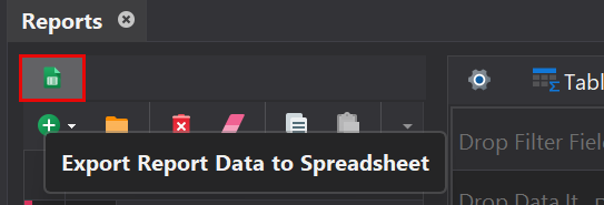
Excel Export
In addition to the three built-in reports outlined above, the software offers a CSV export option for Report Sources, enabling the creation of custom reports outside the platform. Each Report Source is exported as a separate CSV file, clearly labelled for easy identification.